 At WWDC2015 Apple announced a new system font – San Francisco. It has it’s own page, it has it’s own wwdc video and a huuuuge family tree. So let’s learn more about San Francisco display vs text / compact vs normal in this brief review.
San Francisco is a grotesque font, a sans serif typeface. It is specially designed as a UI font and it has lots of features and optimisations to make it look good on screen. It is also the main difference between iOS8 and iOS9 (learn more about our Free iOS9 Vector GUI Template here) After watching an hour long presentation (developers only) and reading thought Apple Developers documentation I think i finally got it! So let’s briefly review all the features of the new font.
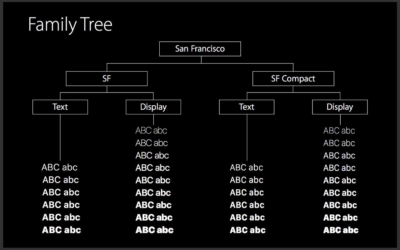
San Francisco VS San Francisco Compact
There are two fonts SF and SF compact. SF is for iOS and OSX and SF compact is intended to be used in Apple Watch. So whats the difference?
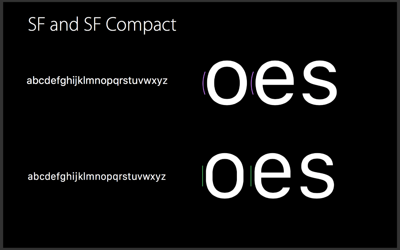 The two fonts are sibling designs with the biggest difference being how round shapes are handled. The flat size allows bigger space between the letters on the Apple Watch. Which sort of makes sense because of it’s supper small screen.
Another readability feature in both fonts is bigger lower case letters (bigger x-height). Which as pointed out are the letters you see the most. Also the Upper case are shorter and numbers align with them.

Display Versus Text
Both sibling fonts have 2 optical sizes. Display and text. Display is intended to be used for titles and other kinds of big ass text while Text is for smaller text. The differences are in the negative spaces between letters,the spacing and the shapes of the letters. All differences are aiming for greater readability in small texts.
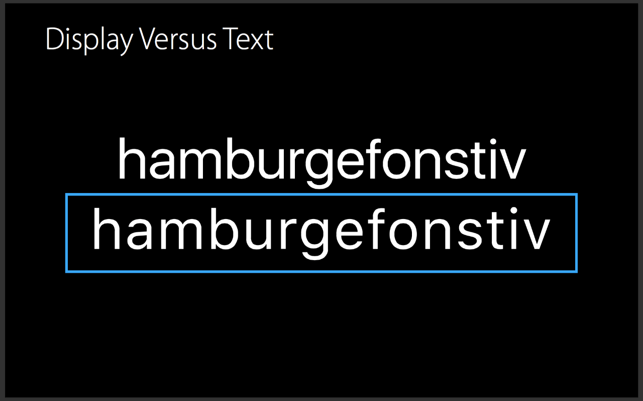
The OS will change the two fonts automagically text is for sizes up to 19pt and display is from sizes above 19pt. This will not be the case in design software though. We will have to have in mind if such a change is needed and do it our selfs. 
Tracking is size-specific as well. ![]()
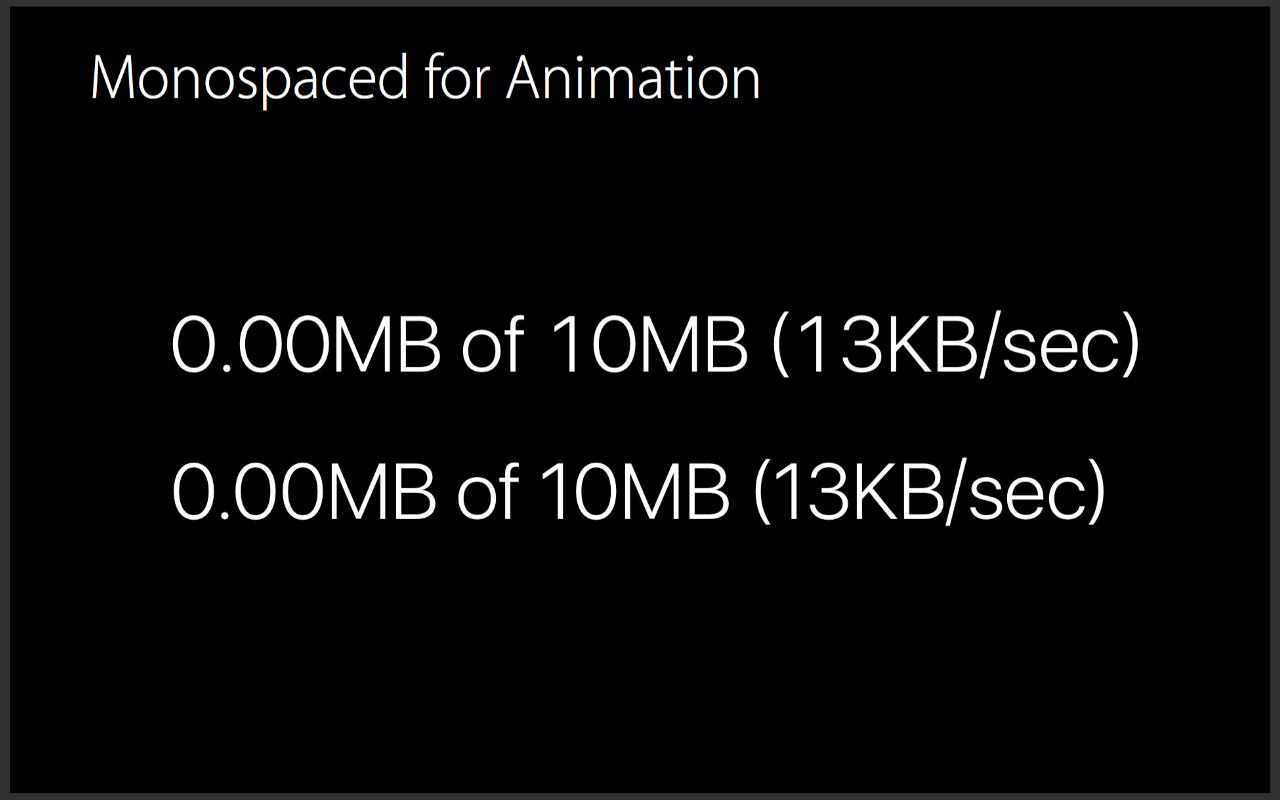
There are lots of other features that can be turned on/off with code.
Like the vertically centered colon (the lovely two dots in 9:41), alternate symbols and monospaced letters.


 You can download the font from developer.apple.com/fonts . Use of the font on other than OSX iOS Watch OS is prohibited. The file is broken and doesn’t install on windows machines on purpose.
Here is a windows compatible version of SF also suitable for non-developers who cannot download the one on the developers site.